Tuesday, December 29, 2009

HERE;S YR NEW YEARS PARTY!!!!!

Come to this show.
it's Unicorn Basement's last show..on earth.
w/ Gospel Gossip. Gay beast. MC/VL and Week of Shark
Dec. 31st (Duh!) 7th St. Entry. $8.
if you need to get in for free. I could probably get you on the guest list.
XOXO D
14'' X 23'' 4 color silkscreeen.

Monday, December 14, 2009

STILL REEELING

Hey. Thanks to everyone who came out to the art show last Saturday. I worked my BUTT off getting that installation ready. Pixxx of the whole thing to come.

For those of you who didn't make it. here's one of the prints that were on the installation.
5 color screenprint. 20'' X 30''.

a BIG BIG BIG HUMUNGOUS thank you goes out to my good friend Anna, who hosted the show and who's amazing and mysterious prints and paintings shared space with mine.

Big plans out here. A couple poster things, t-shirt designs, and then getting band merch for our upcoming European tour. WE GET TO GO TO MOSSKOW!
and on that tour I'll be having a couple of one night art shows to coincide with the band. My first solo show will be in Groningen NL. and I'm going to be doing another installation. I learned so much from this last one.

stay tuned for those pixxxxx!
XO
dANimal

Sunday, November 22, 2009

ART SHOW POSTER

Just finished this collab with my friend Anna Tsantir. She is amazing and makes very mysterious polymer plate prints. We're having a VERY informal art show in her studio. I'm going to be making some larger pieces and she's doing some wall collages and paintings. It should be really funnnnn! We just slammed this poster out a minute ago and I think I like it.
I've been OBCESSED with parade imagery for the last while and I see it being a theme of future work.
4 colors 13'' X 19''
the show is called "BIG WEST". it's a one night only affair on Sat. Dec. 12th from 8-1am in the Carriage house behind the Casket Arts Building in Northeast Mpls. 1720 Madison St. NE
Maria (frankie teardrop) will be spinning records (no wave's her speciality)

Saturday, November 21, 2009

BEE MY PLAYTHING

Here's my submission for the annual "Toys in the Attic" art show. It's a big one night only art-4-charity thing happening on December 4th at the SooVAC. Proceeds go to Toys for tottttts.
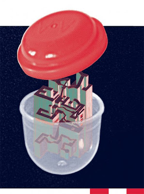
Marble madness in a bubble. I was wanting to think about the formats and spaces for play, avoiding an actual depiction of a toy, but rather illustrating it's surroundings. Thanks Michael for lending me yr bubble.


4 colors 18'' X 24''


XO

Wednesday, November 4, 2009

IF YOU LIVE IN NYC!

I have a couple pieces in the Radar Eyes: A Survey of Hallucinogenic Printmaking group show that was curated by Ruben Kincaid and my pals Seripop. This is the 2nd time the show has been shown. I went to the opening in Chicago and it was seriously mindblowing. Check out amazing works by Mat Brinkman, Sakura Maku, Greg Pizzoli, Mat Daly, Sonnenzimmer, Seripop and so so so much more. The show is HUGE. so much work, it's insane.
here's the poster.

opening Friday, November 6th, 7pm at Fardom Gallery, 25-17 41st Avenue, Long Island City. Around the corner, a secret space will stash many more prints and a new installation by NYC artist Sakura Maku

In other news. I'm finally working on a website. Look for www.dnml.org very soon. Eventually I'll be hosting my blog on the website, but when I do, I'll make sure to let you know.
XXXXXXXOOOOOO
oh. and I JUST TURNED 30! and had the best birthday on earth. totally sick!

Sunday, October 11, 2009

pumpkin cross


20'' X 28'' 4 color silkscreen
poster for
Brute Heart's LP release
w/ Gay Beast
The Chain
Tips for Twat
sideways pumpkins upside down cross!
HAPPY HOWWWWWOWWWEEEN!!!
come celebrate with me. It will be my golden birthday on October 30th!
the friday before holloween.
3119 2nd Ave. S.
Minneapolis MN 55408
after 8pm
BYOB/P
and PRESENTS
D

Wednesday, September 30, 2009

Not Here. Not There. YET!

I recently sent over a package of posters to Insound for their online store. They wrote about me in their blog. And they are sending me a check for some posters. I like them. and when I can afford it, I buy records from them.

It is 3am. I'm sitting in the Logan international airport in Boston waiting for Airtran to open their gates so I can check in my luggage and GET HOME! I had such a magical time in Providence. I made art, met lots of amazing people, hung out with old friends, had visitors. It was so amazing to see all the inner workings of AS220. It's a very very interesting model for an arts org. Check out their website and marvel at my friend Arley's amazing typographic skills that grace pretty much every form of correspondence for the place.
The last 24 hours have been crazy. I printed a 4 color print, slept 2 hours, prepped for my artist talk, gave the presentation, drank a whiskey, said goodbye to my new friends, packed up my temporary room and my prints and got to the train station to catch the last train to boston.

I'm heading home at this ungodly hour BECAUSE i'm going to be in this poster art show at the venerable Walker Art Center. It's going to be a very casual affair. Poster tables set up in one of the lobbies where local posternerds will be lurking around tables selling their work. It's in conjunction with the walker's screening of Died Young Stayed Pretty. Which is a documentary that makes poster people look like freaks and social outcasts. (are we?)
POSTER MART

And lastly, since I have nothing better to do right now, I'll give you a couple process shots from the first art print I did in Providence.
ME IN THE SHOP! PRESSSHHUSSS

HAY FAGGOTT GET TO WORK!
1st and second layers. (orange and transparant red)


Third layer (transparant blue)
there's the screen.

that's what happened. (splooge)

Fourth (Huge transparant split fountain flood layer. In providence they call them Rainbow rolls_

oh look! my new friend Andrew came to visit

Fifth (Black)

Sixth (Transparant Grey) here's the money layer


Seven (little white blobby)

VOILA!!!

Tuesday, September 29, 2009

UNPLANNED PREGNANCY!

I'm currently on a work bingggge. I finished this layout WAY later than I wanted to. and now I'm going to have to print all 4 layers tomorrow. Which is totally doable, because I am only printing like 25 or 30 of these.

I spent a million years drawing all these drawings and then hating them, and then collaging other drawings and stuff into a design that I despised, and then finally, just when I was going to give up I found this picture of this woman and then everything came together. It works perfectly (IMO) because she's about to speak into the mic, but there's these black bars over her mouth. And then in her hat there's a strange, mean geisha looking drawing with all these bands of colors with symbols in them. I've been really thinking alot about subliminal, unconscious and unknowable language. So, just like the woman, she is veiled in all these halftoned modernist lanterns (lightbulb goes on A HA!) and then there's the little spark at the top, making it a real A HA moment. and then there's a bunch of other symbols printed underneith the black layer, so you won't be able to see them until you hold the print up and see the texture of the ink. DETAILS. and another veiled layer of communication. That's the idea. and it was sort of happenstance and accidental that I got there, but I'm currently happy.

4 colors. 16'' X 28''

I am now going to start compiling notes and images for my end of residency presentation on Wed. I'm hella nervous about it for some reason, although excited to have to research on stuff that I enjoy so much.

sigh of releaf. so glad I got that layout done. Pix of print to come.

D

Monday, September 21, 2009

GO TOWARD THE LIGHT!

I didn't set out to do this AT ALL, but I ended up making this design, and it really reminds me of 70's religious art. I like it, and it feels different from some of my stuff, but it's also kind of weird. I was trying to depict a deathbed. What do you think?

4 color silkscreen 22'' X 26''. Printing tomorrow.
I have to say that having my own screen setup is very luxurious. I love the communal aspect of working in the shop, but some of the chaos and unpredictability of not knowing when/how/how long..etc. you will be able to work, can be stressfull. but don't get me wrong.. this residency has given me a ton of ideas, and sort of planted the seed for wanting to start a community print shop in minneapolis. I think it really has to be done. There is fancy schmancy Hipoint center for printmaking, and then all the letterpress stuff at the Open book, but I feel like both places don't really engage with the community like the printshop here. ohhhh dreams. anyway. back to draw.

Saturday, September 12, 2009

THE BIGGEST ONE!!!

off to print this one. it's as big as the shop would allow, and the most colors i've ever printed.
22'' X 30'' 7 color screeenprint.

extrapolated from the dithering technique and drawings from an earlier poster. this one i wanted to get a bit more looose and crazy. and this one turned out to have a good horror film poster vibe, which i'm stoked about.

providence is SO SO SO MUCH FUN! i've been drawing every day, doing stream of conscious abstract stuff, hanging out with tons of friends, having visitors, and taking everything in. I want to live here, or at least have a second home here.

I'm doing a print based on some photos of a menacing leatherdaddy and his dog...more sharpieface and body drawings, a cinder block and hopefully some more really big, many colored prints!
wish me luck.
XO
DANIMAL

Sunday, August 30, 2009

IN A FEW HOURS!!!!

Working on no sleep. Heading to Providence.
Wanted to print this thing before I left, but it looks like it will be the first thing that I print in the AS220 cooperative Print shop.

4 color silkscreen. WHOOOO! overprints. This is the cover for my band Gay Beast's new seven inch on Gilgongo Records. It has the first song that we ever wrote together!

back cover, with an extra tab that folds around.


I'm going to be living, making, and talking about art in lovely Providence RI for one whole month. If you are in the area, COME VISIT! I'm going to catch up on my running, and hang out at the libraries, indulging in art for arts sake.

I've also started an art print that contains some of these colorwheel thingies. It's one of the many things that I'm sending out for inclusion in a very exciting experimental silkscreen book that I was asked to be in. More on that later.

now to pack, and tie up all the billions of loose ends. OOOOOOEEEEEEEEEEAHHHHHHH!

Tuesday, August 18, 2009

GAY PROJECTS//// PROJETS HOMOSEXUELS

So a fellow gay in town was putting together a "Picnic Operetta" here in town and asked a gay poster artist (me) to do it. It's Orpheus and Eurydice and it's going to be performed in various gardens around the city during August and September.

4 colors. 8.5 X 23'' Hella gay pretty vibes.
it's dumb that i've never done it before, but I printed the posters 2 up on the same sheet. Plus, since I didn't want to list all the performance, I printed separate cards that match the poster that overlay to be put on for each specific performance. there are 8 total. MODULAR


Wednesday, July 22, 2009

Paper Trains!

Just sent off a batch of these record covers for the really really rad chicago band Paper Mice. I'm super glad they asked me, because the record was a good challenge for me. Dave writes the best, and most hilarious lyrics, so even though doing the typesetting for 16 songs was a chore, I could always find entertainment in the words.

All the songs are about really ubsurd, real life stories that he read in the news. Their band name is referring to different comic book mouse characters. I didn't want to go to literal with either their band name, or the title of the record, so I went with something childish and nostalgic (trains) and tried to collage together drawings and photocopies, for a "papery" aesthetic.

Type for inserts and back cover was typed with a typewriter, and then I went in and removed some of the serifs on all the characters. which also, took forever.

Cover:

Back Cover:

4 color silkscreen
CD Face (included w/ LP):

Insert:

and

looks straightforward, but it took forever to get all that type to work right.
LP side a:

LP side b:

Saturday, July 11, 2009

FUNNY FORM!

Here's a mockup of a t-shirt that I just printed for the outrageous local band Unicorn Basement.
I set out to do something completely different, but what ended up was this thing. It sits very big on the shirt, and was printed on Teal, pink and grey shirts. My favorite parts are the little drawings at the bottom...and how the colored arrow points to yr pit. Using that severed fingers with legs thing again for sure.

XO
DANIMAL

Saturday, May 23, 2009

HUGE PROJECT IS ALMOST COMPLETE

This summary is not available. Please click here to view the post.

Monday, April 27, 2009

PROFESSIONALISM VS. HACKISM


4 color silkscreen 18'' X 24.
3 split fountains!

UGH! ACK! COUGH! WHEEZ! PUNCH! SCREEM! AAAAAAAAAAAAH!
o.k. got to get that out.
So I recently got hired to do this tour poster for my friends in the band To Kill A Petty Bourgeoisie. I did their last Euro tour print and that thing was a nightmare to print, because I didn't know what I was doing. This time around, I had learned a few tricks and was more ready for the job...well, at least I thought I was. I of course waited until the very last minute to do the poster, I was finishing the design two days before they left, and had 1 day to do all the printing. This would be fine, but I had to work the day that I wanted to print, so everything was pushed back until I got offf work at 11pm. I printed about 150 of these suckers from burning screens to finished product from 11pm to 9am. I didn't sleep.
o.k. but before I went to work that day I sent the band a proof of the design. they were totally into it, but they wanted me to add text that said the name of the other band on tour and they wanted it to say "tour 'o9". Fine, I said. Rushing to redo the text before heading to Kinkos to print out the separations and go to wwork.

I'm printing and printing and printing and then at 7 am in the morning, I realize. TO MY HORROR, I MISSPELLED THEIR BAND NAME! Oh God! This has happened to me 2wice. where I've misspelled really really important details. luckily the first time, I had enough time to reprint everything. This time, NO. They were leaving at like 3pm the next day and I physically just couldn't bring myself to figure out a way to print over my mistake and reposition the text. So I just had to deal with it.

I talked to the band the next day and I confessed. They were all stressed because of other tour details and they said it wasn't a big deal, but I felt fucking awefull about it. I still do. Anyway. I ended up giving them a discount on the prints, and told them to bring back any of the ones that they don't sell, and i'll print over them, repositioning the text and correcting the spelling mistake.
BOURGEOISIE is spelled BOURGEOISIE not, BOURGEIOSIE. UGH.

it's just terrible because the first go around, I was obcessing about getting the name spelled right. I quadruple checked. but then when they needed that last minute change, I must have just been looking at how all the text was fitting into it's little area, and spacing and other stuff, and I just overlooked it.

Lesson Learned. No matter how tired, or out of it, or dumb you feel. ALWAYS proof your text like 5 times before printing separations. Suffice to say, it will NEVER happen again.

The image is pretty. it's a drawing that I did on my friend Anna's face. I drew on her with a sharpie, took a photo, and printed it out, and then traced it. It was really nice to draw on someone. i'm going to do it again. I was trying to do some kind of goth version of the TARKUS cover. If you don't know. look it up.

oh. and I couldn't stand looking at the incorrect text anymore, so I switched it.
moving fucking on. I'm printing LP inserts today. Tons of band stuff in the works. Tees, aprons, 7'' , LP. etc. etc. etc.

Wednesday, April 15, 2009

HEAVY FOCUS 2


3 screens! 18'' X 24''

maximizing the fewwest screens possible to make the trippiest of stuff.

it was fun to draw the gross perverts.
it's for a noise festival here in town called heavy focus. I think my bandmate is dressing in drag for his performance. should be fun. should be lots of pottt smoking, which isn't my thing, but funny to watch.

XXXOOOO
DDDDDD

Thursday, April 2, 2009

Vanity.

This is an exception. I promise I won't post tons of pictures of myself, but this was a cute pick of me and my bff. i'm on the right.

Thursday, March 26, 2009

IT'S DONE. FINALLY!!!

Yes. I've been anxiously working on this album art for a while now. Glad it's done. Here is the panels from my band Gay Beast's album "Second Wave". It's coming out on Skin Graft records on May 25th. It's gunna be a jewel case CD. and then a super duper deluxxxe 4 color silkscreened gatefold cover, with a silkscreened 4 color process insert. I think that my arms are going to fall off, but it will be worth it. Colors will be tttweaked for LP version. Couldn't have done the computrixx w/out my pal paul.

o.k. here we go.

cryptic cover art. they are masonry symbols from some way back when.

Inside the gatefold. My friend A.K. helped me take photos of my other friend Joann. Then I took the photos and drew these weird jelly suits. Are they dancing? or fighting? The one on the right has a paper plate mask on.


Insert. photo from Ms. magazine.

back of CD tray card. that text took 4 EVER to get right. ugh.

CD face. and LP center labels. (LP labels sllllightly different w/text)

The album is called "Second Wave" and a lot of the songs have lyrics about 2nd wave feminist ideas of utopia. I was really interested in trying to convey something that was about communication, and idealism.

o.k. to bed, to bed. drawing on peoples faces tomorrow.

XOXO
DANIMAL

Thursday, March 12, 2009

POWER ELECTRONICS!!!!

So recently, a good friend of mine asked me to do the layout for his most recent limited edition CD. His project is called Slapping Purses. It's like, noisey electro stuff. Very gooood.
Anyway. He had some specific requirements. He wanted it to be a 4 color process print, and since the record is called "Diamonds Are Forever", he wanted there to be explicit liz taylor imagry.

I only included one image of liz, but did a bunch of very opulant colored pencil drawings that surround her. I'm experimenting with drawing in color (marker, acrilic pens, colored pencil etc.) and seeing how halftoning affects those marks.

It ended up being a lot of work doing the layout (thanks P!), and I haven't even started printing the bitch, but here's what we got.


Cover image: those are scanned in fleshtones from a gay porn mag. and also liz taylors face. I think she would approve.


Back Cover.


Inside Left: (it's a homemade digipak..without a tray) Really pleased with how the numbers turned out.


Inside Right: simple. mirrored from cover.

Now off to 1: test my new light table. 2. Print out the separations. 3. PRINT PRINT PRINT.
it's only a run of 200...so most of the work is actually done.

XOXO
DANIMAL

Tuesday, March 3, 2009

BANANAS!!!!!

Here are a couple installation shots from the print show that I was recently in. It shows the banana wallpaper that I made for the show. I printed about 1000 2 color wallpaper panels on yellow paper. I plastered the wall, and then had a stack of free prints at the base of the wall. Unfortunately I don't have a pic of an individual panel, but they are 18'' X 18'' squares of interlocking grid bananas. I actually put artificial banana scent in the ink, however, the smell has diminished so much that you can barely barely tell it's there. It really sucks, cuz I was VERY sick to my stomach from the banana smell while I was printing them. Anyone know of good scent additives to put in screenprint ink or paint?? If you order a poster from me, I'll mail you a couple panels in addition to yr purchase. HINT HINT.


note to self. DO MORE WALLPAPER

XO
DANIMAL

Saturday, February 28, 2009

LIVE TO MAKE MESS!

I am a lucky jerk. My house is amazing, and the best best part, I have a really humungous semi converted attic that houses my print studio. All for $300 a month! and I only share the apt. with 2 people. This is quite a steal, even for us podunk hicks in minneapolis. I took some photos recently of the space, and of a couple test prints to give you a feeeeel. It's messy. it's ghetto. but it's mine.

The main room. Here's my print table, and print rack. I brought the rack up to the attic myself, and I still don't understand how it fit up the tiny winding staircase and all put together all by myself.

This is my print storage system. haha. I REALLY need a flat file, or some storage system STAT. Currently, most prints are just piling up on tables, just covering in dust, and threatening to ruin themselves.

INK, Space heater (it's COLD), and terribly tiny cd player

Here is my exposure "unit". It currently consists of 2 halogen worklights (the red things on the floor) and the glass table that you see. I'm rebuilding a new one this week. I'm getting a bunch of fluorescent fixtures, and i'm going to wire them together in a box directly under the glass top, and put blacklight bulbs in them to get all my exposure times way down.
The exposure table also doubles as a really really bright tracing table. When I'm tired of using tracing paper, I fire it up to work on all my separations.


Here's the guest room / washout area. This is where bands crash when they are coming through town. Unfortunately i've had to wake up a few slumbering souls at 5am when I have to wash out my screen. It's LOUD!!

Here's a closeup of the washout. It's a double sink with the middle cut out. It has no faucet, but it drains to a nearby smaller utility sink with a faucet and hose attachment. My pops helped me do the plumbing. Say hello to my friend P. We're going to backlight this sucker next week as well. FUNN


Test prints!!!

Come to the studio sometime
XO
DANIMAL